Our Brand
Have you noticed something a little brighter about Gilgandra Shire Council lately?
Gilgandra Shire Council shows its future direction and a nod to history with a splash of colour for its new branding!
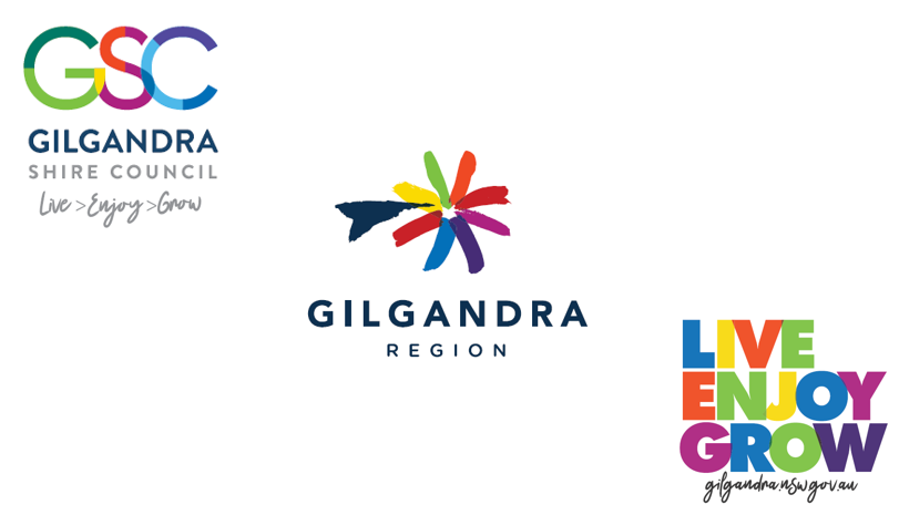
The mosaic of colours reflects Gilgandra Shire Council’s new look, representing our community, services and people coming together as well as the layers of both our community, history and landscape.
The new branding has been developed to achieve consistency across Council services, to give the community a sense of pride and ownership of the region, and to make evident the potential and opportunity for visitors and investors in our region. A Branding Working Party consisting of Councillors staff and community members assisted in the development of this branding.
Gilgandra Shire Council is focussing on the future and reflecting Council’s Vision through the words, ‘Live, Enjoy, Grow’. Encouraging leading a lifestyle in Gilgandra, enjoying what our region has to offer and building on the strength of our community and economy.
Through the process, a more aspirational focus for the Council was realised, and ‘meeting community needs’ was seen to be just covering the traditional bases. Live > Enjoy > Grow focuses on the needs of today, while also looking into the Vision and future of our Shire.
Mayor, Doug Batten says,
“The new brand is modern, energetic and aspirational. It will provide a great platform for a powerful promotional program to attract more visitors and businesses to our unique region. It is about building pride in the community and pride in our special region.”
The community themselves were important contributors to the creation of this brand.
General Manager, David Neeves says,
“This has been a result of several months of consultation and planning. Through a targeted Branding Working Party consisting of Councillors, staff, committee and community representatives, valuable insights were gathered to provide a snapshot into the essence of Gilgandra, our values and our aspirations. This key feedback was then translated into the brand story and strategy and finally, into the brand image that you see today.”
The brands developed include a new Council Brand and new Region Brand.
Economic Development Manager, Randall Medd is looking forward to seeing the new brand rolled out to capture the interest of potential investors and visitors to our community.
“It is an exciting time for Council, there is significant activity scheduled for infrastructure over the next 5 years, including $5.3 billion within our region.”
“Furthermore, with many successful grant opportunities coming to fruition, the attraction to our region only increases. This new branding will be seen on new highway signage to come over the next few months which will only reinvigorate and liven the experience as you enter Gilgandra Shire”
Kathryn Larkin, Community Engagement Officer adds that this strong community connection allows community groups to also utilise the branding for their own promotions.
“Council is looking forward to seeing the continuation of our strong community spirit through community events and activities on offer. We’d like to be able to support the community in their endeavours to promote and achieve successful events in our region.”
Ms Larkin comments that the brand story was developed in recognition of our unique indigenous history, our rich agricultural background and strong military heritage.
“The brand story, which can be found on Council’s website, speaks about our history of the windmills, the “Coo-ee Spirit” beginning with the Coo-ee March and continuing now with our community spirit evident in our volunteers. It speaks to Gilgandra being a region built on the success of an active community, with its heart in the people and in the land. It describes also the natural landscapes, the underground river, or ‘long waterhole’ as ‘Gilgandra’ means in Wiradjuri, the town being a meeting place between Aboriginal nations, the link to major highways, with the backdrop of the Warrumbungles mountains.”
General Manager, David Neeves says,
“I want to thank all Councillors staff and members of the community who participated in the process and provided input for our new brand.”
Adding,
“The launch marks the beginning of a comprehensive brand implementation process across Council’s services and assets, including fleet, buildings, signage and communication channels. This process will happen in stages over coming months. You will see our staff in new uniforms in the coming financial year, it is big job, but an exciting one. Watch this space!”
The Gilgandra Story
Gilgandra is a town known for windmills, with over 300 once spinning on the horizon of Gilgandra. Even with just a hint of wind, many blades spun into action, building enough momentum to bring life giving water to the surface and to the community.
Much like the windmills of Gilgandra, the people of our region have spun into action, working together for the greater good of the community. It is a quality that goes back generations and is evident in Gilgandra’s rich history.
The “Coo-ee Spirit” began when the tragic news of Gallipoli reached Gilgandra. This spun Captain Bill Hitchen into action with the “Coo-ee March”. Starting with only 35 men, the momentum built as they marched all the way to Sydney. Rallying troops along the way in aid of the War effort, they reached their destination with over 300 souls in tow. Gilgandra was put on the map for this momentous effort. This was the community spirit of lending a hand.
This community spirit is evident still, whether it be in aid for the floods of ’55, the fires of 2009 or today as farmers work towards fighting one of the worst droughts in Australia’s history, local schools, people and community services are holding fundraising events, donating what they can to help out.
Led by Council, the Gilgandra people lend a helping hand, and work together giving needed assistance to the community. These charitable and ethical qualities have been ingrained in the community for generations, like the windmill blades turning together, like the Coo-ees marching together, the people of our community work together for the greater good of Gilgandra.
Gilgandra is a town built on the success of an active community. It is in the heart of the people and the heart of the land.
The meaning of the word ‘Gilgandra’ is ‘long waterhole’, of Wiradjuri origin. Gilgandra is described as being a meeting place between the Wiradjuri, Kamilaroi & Wailwan nations. It is also an agricultural landscape, close to the Warrumbungles mountain ranges. Many of the logo concepts are reflective of such natural landscape.
Behind the Brand
The branding process saw 3 positioning pillars for Council; its community focus, spirit and strength & stability. The mosaic of colours are the tiles of our community connecting and coming together, with the vibrancy a reflection of our community, as well as the variety of services Council offers. The dark blue and capitalised font displays the professionalism and strength of our Council, while the arrow reflects the aspirational direction of Council.
The Region Brand is a modern reflection of a symbol that could be interpreted as a windmill, a star or a flower reflecting the natural landscape of our region and region’s history. The brushstrokes represents the layers of our community, including the people, all working together for our region. The brush strokes further represent the physical layers of the Gilgandra region’s landscape.
The colours used across the branding are reflective of Council’s services and the natural landscape of the Gilgandra region. The colours are built up of Council’s services and blends with the colours of our natural landscape. This represents both the diversity of Council, the rural landscape of our region and the people within.
While the stacked words Live > Enjoy > Grow is able to be used as a design element across all of Council services, as the central link between all.